Redesign – Biomedical Engineering
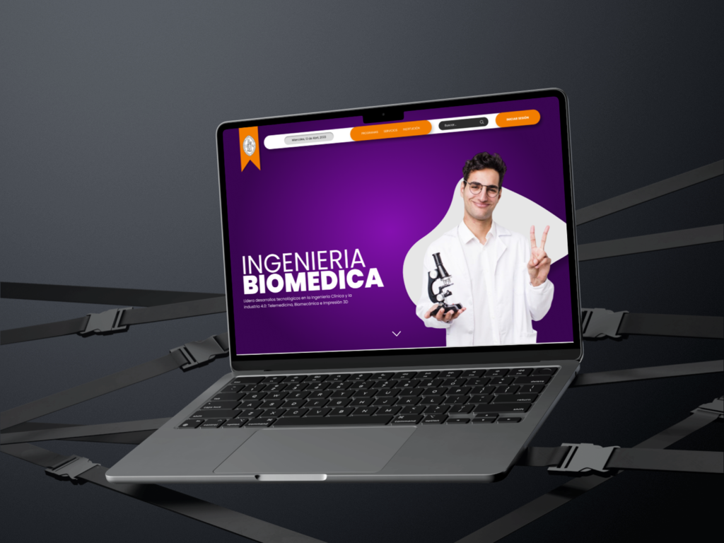
UX/UI web redesign Biomedical Engineering. A strategic digital evolution for a new academic program. Transitioning from visual clutter to a sophisticated, user-centric interface. ROLE UX/UI Designer PLATFORM Web (Responsive) TIMELINE 6 Weeks STACK Notion, Adobe XD Minimalist Flow The challenge. “The original site suffered from visual pollution and a lack of clear hierarchy.” For the launch of the Biomedical Engineering program, the university required a modern digital face. My mission was to create a landing page that inspired innovation through a clean design that prioritized speed and content clarity. some important figures 0 % SIMPLIFICATION Audited the original menu with 24 items, streamlining it to 5 essential sections focused on student needs. 0 s QUICK ACCESS Admission information can now be reached in under 3 seconds, significantly reducing the bounce rate. 0 % MOBILE FIRST Optimized specifically for the 70% of prospective students browsing via smartphones. Visual Foundation Every design choice was rooted in the convergence of two worlds: the organic complexity of biology and the geometric precision of engineering. We moved away from the university’s legacy interface to create a space that breathes innovation, using high-contrast colors and a modern typeface to establish a hierarchy that respects the user’s focus. COLOR PALETTE INNOVATION #F97316 Symbolizing the energy and future of the engineering field. HERITAGE #7C3AED A bridge to biological sciences and institutional authority. AUTHORITY #0F172A Providing trust and deep contrast for long-form reading. CLARITY #F8FAFC A clean, breathable base that eliminates visual noise. TYPOGRAPHY Sans Serif Primary typeface Aa BLACK 900 For strong headlines & key data highlights. Aa LIGHT 300 For immersive reading and secondary info. CHARACTER SET SPECIMEN ABCDEFGHIJKLM nopqrstuvwxyz 0123456789 DIGITALACCURACY The genesis This project was my digital awakening. It was the moment I stopped drawing screens and started building experiences. As one of my first deep dives into prototyping, it challenged me to think beyond aesthetics. I realized that a university landing page is the first step in a student’s career. Transitioning from abstract ideas to a functional, data-backed interface was a turning point in my creative process. 01 Organization I used Notion as my central brain for Information Architecture and Research notes. 02 The Interface In Adobe XD, I learned the power of components for high-fidelity interactive prototyping. What’s next? The journey doesn’t end here. Choose your next destination or reach out to start something new. Back PREV Previous CONTACT — Contact — Next NEXT Project